World Economic Forum Dashboard
Designed and shipped a dashboard tailored to the specific nuances of WEF hierarchical data structure.
Details
My role
Data Visualization Designer, Lead
Company
Accurat
Client
World Economic Forum
Deliverables
Dashboard, PDF report
Timeline
3 months, Nov 2023–Jan 2024
Challenge
Our objective was to develop a design framework that is fundamentally agnostic to the specific nuances of the WEF dashboard, aimed at accommodating the complexity of their data. The Future of Growth Dashboard represents the first step in a more ambitious mission to ensure our approach remains relevant and useful for future reports and datasets.
wireframe
Layout approach evaluations
As I explored different dashboard layouts, my approach was anchored in accommodating nested hierarchical data structures and ensuring a high level of flexibility in the long run.
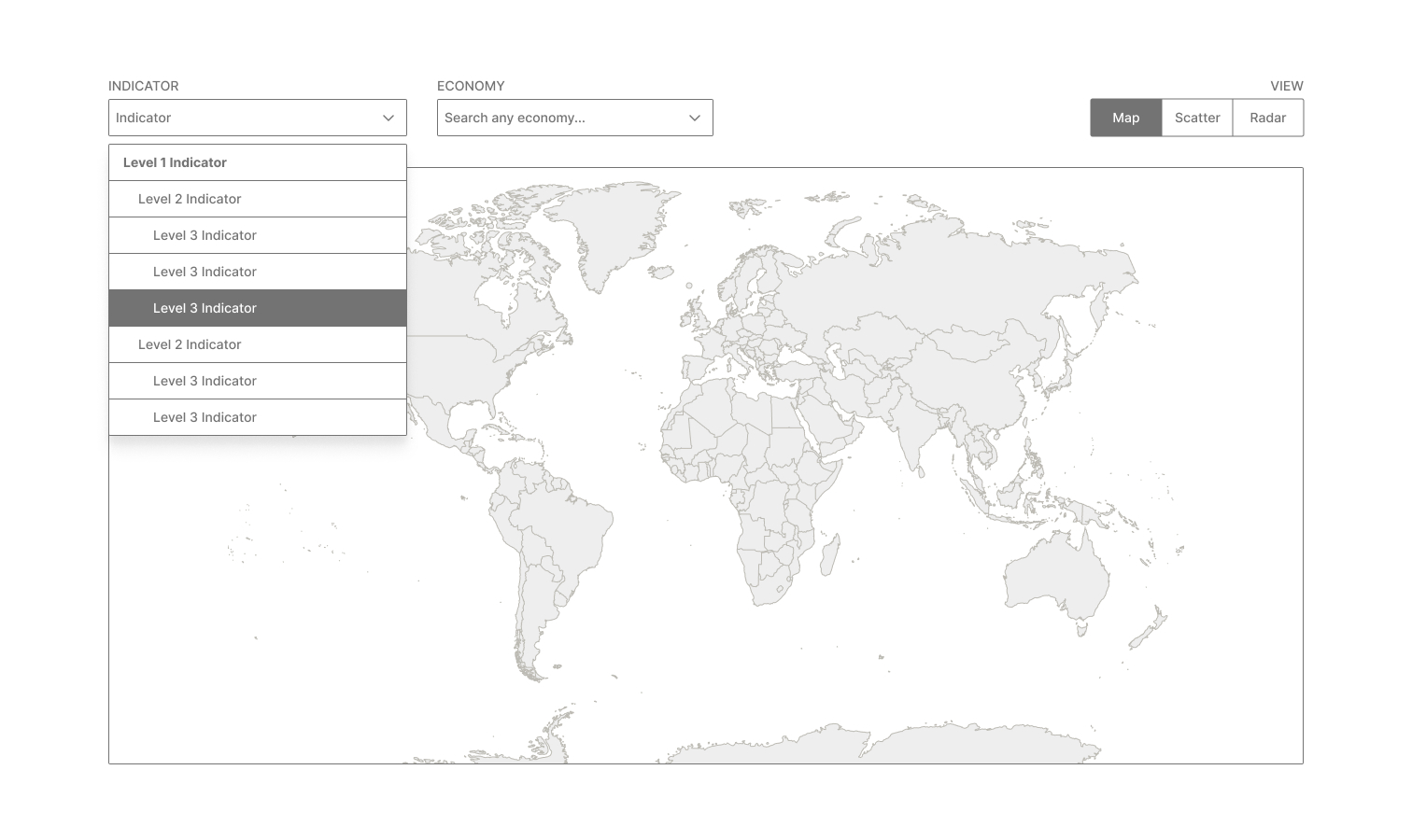
Image: Layout 1
Layout 1 displays filters above the map, just like in Global Gender Gap data explorer. Even if the layout is simple and unclettered and has a low cognitive load, the data structure is completly hidden behind a dropdown, and there are no summary statistics nor filters.
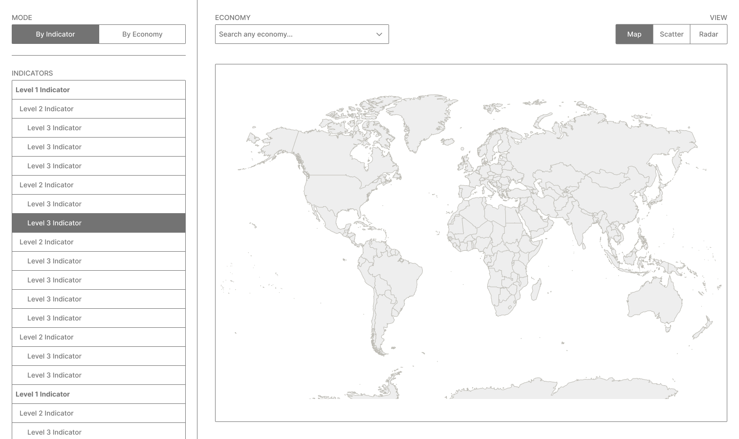
Image: Layout 2
From there, I also explored the complete opened list of indicators on a side panel, but felt it was kind of distracting/too busy (see Layout 2 above).
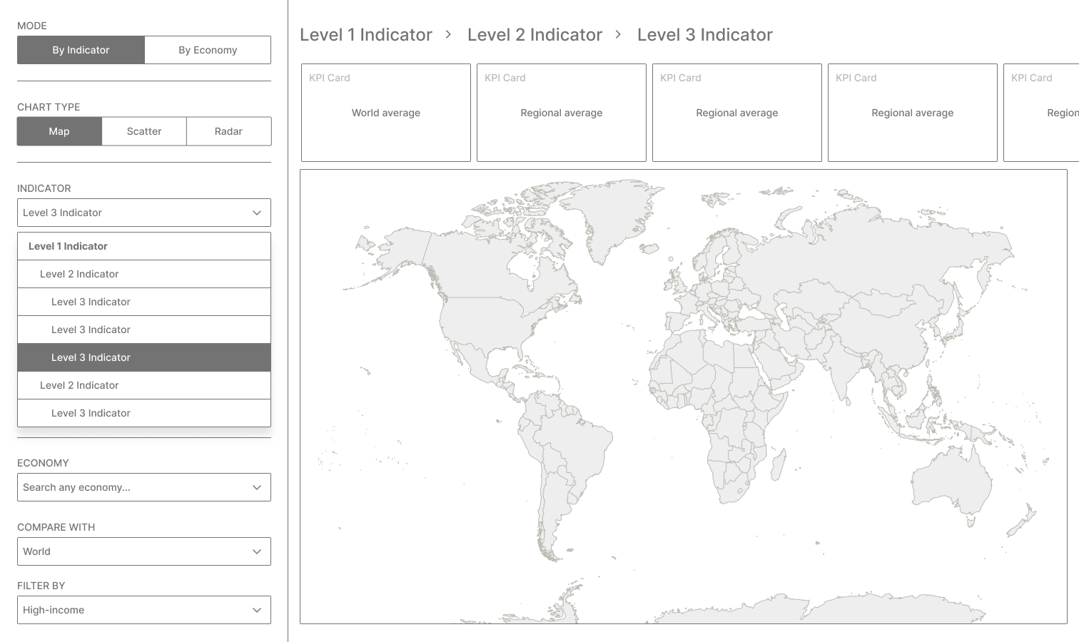
Image: Layout 3
I eventually found a good spot between clarity and power with Layout 3, where I moved all filters and controls in the side panel, and hided the Indicator list within a dropdown select. At the same time, I thought that having a breadcrumb at the top would have been useful to give context on the depth of the data structure—and also a sort of a title to the map. Additionally, I was thinking about a carousel of KPI cards above the main map, to provide some quicker higher level insights.
design
Designing for depth and discoverability
The follwing step was to define (and refine) the overall UI in detail, and test the solution on both our colleagues at Accurat and the WEF team.
To encourage a deeper exploration of the data, we added a “Drill down to…” call to action after each aggregation levels (last one excluded).
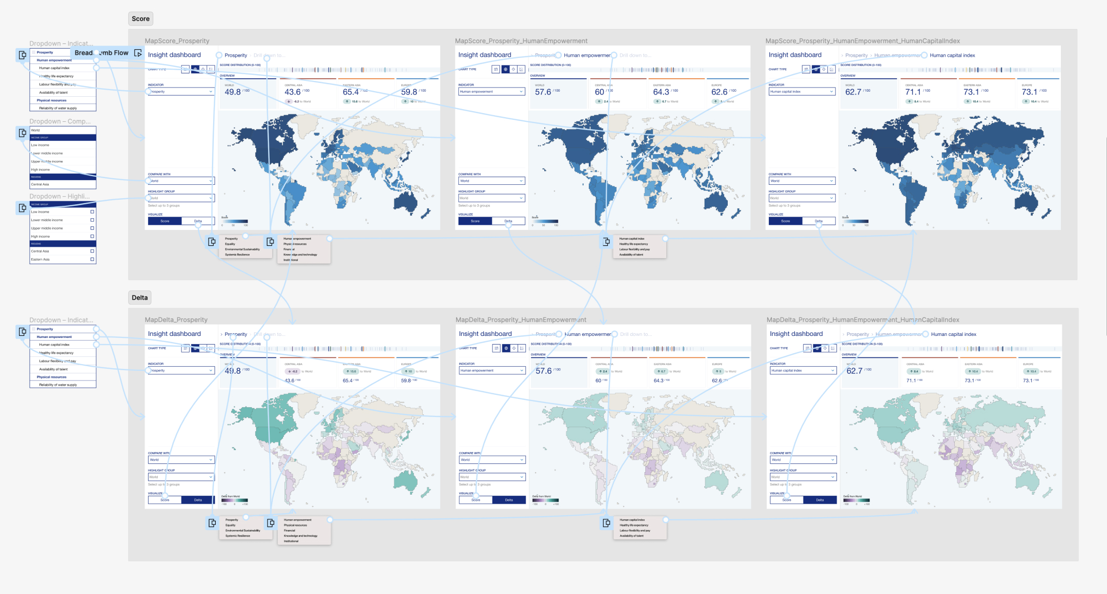
Image: Figma prototype I did to ensure the the design was intuitive (happy path!).
This overall approach proved useful during usability testing, as the breadcrumb component served as an indicator of the current position within the data, giving a precise visual cue of the actual depth while navigating different levels of granularity.
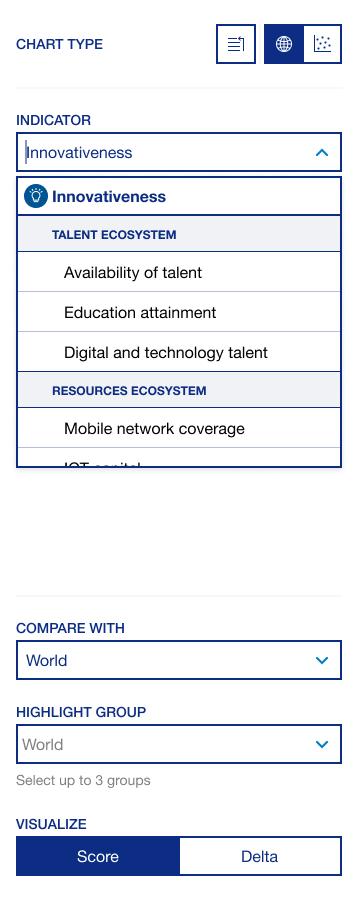
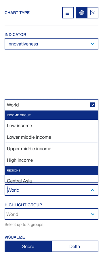
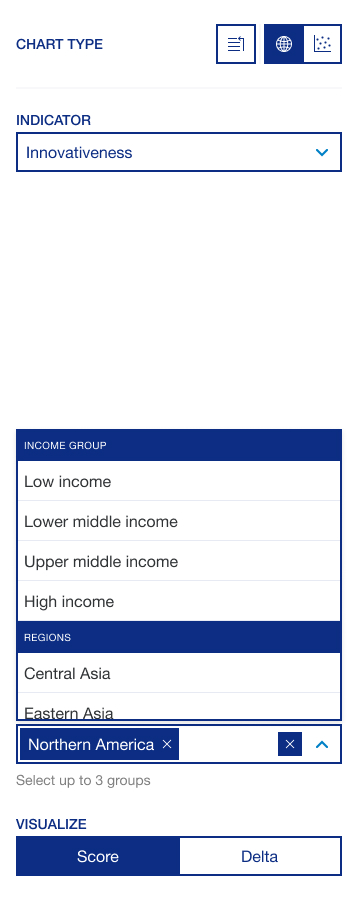
Image: Side panel design, final version (map view).
Additionally, features such as "Compare with" dropdowns, "Highlight group" functionalities, and visually distinct map palettes are all geared towards making the exploration of complex datasets not only possible but also engaging and actually insightful.
Video: "Visualize" segmented control interaction.
When designing and implementing the scatter plot view, we prioritized a few key things:
- The chart aspect ratio needed to be fixed at 1:1 to guarantee equal proportions between the x and y axis at any breakpoint. As scores always ranged from 0 to 100, we wanted to avoid misleading perceptions when decoding the data.
- Dots needed to transition to their new position when a different indicator was selected.
- We needed to be consistent with the controls set up in order to reduce the learning curve when using different parts of the tool. Also, components "Compare with" and "Highlight group" needed to share their state between the two visual models.
Video: Scatter interactions.
Even though we kept the same structure, on the scatter plot side panel we added some additional controls tailored to this specific type of data vis:
- A second indicator selector—as the visual model required two indicators to be selected, one for each axis (X and Y).
- A "Color" segmented control to color code the dots by either region or income, allowing for multifaceted analysis within the same view.
- A "Search" dropdown to allow users to quickly find and focus on a specific economy without the need to look for it within the chart.
takeaway
A closing thought
Looking back at the evolution of my collaboration with the World Economic Forum, from projects like the Global Gender Gap 2022 data explorer to the latest Future of Growth Report 2024, I'm super excited about the future of this collaboration.
I am super proud of what we have achieved together so far, and I look forward to the many more milestones we will reach.
Credits
Team Leader
Pietro Guinea Montalvo
Design
Davide Bruno
Jacopo Poletto
Development
Vito Latrofa
Benedetta Menaggia
Verdiana Pasqualini